The Winter of '87
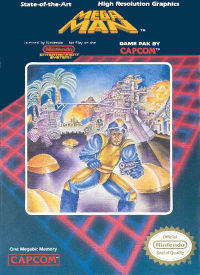
Mega Man I came out in the US* to relatively little fanfare in the winter of '87. Platforming games, while popular, had not become as universally common as they would by the end of the system's life; still, several notable titles in the genre had already been released on the NES. Super Mario Bros. was, of course, a packaged release title and owned by virtually everyone who had a system. Ports of many of Nintendo's arcade platformers came out in the summer of '86, including all three Donkey Kong games, Mario Bros, and Popeye. Metroid was released later that summer, and Ghosts N' Goblins that winter. Castlevania came out to great success and fanfare early in '87, and Kid Icarus and Legend of Kage (the first console platformer to feature multi-directional scrolling, and one of the few ever to appear on the NES at all) soon after.
* I will be discussing Mega Man only in the context of US game culture during the life of the NES; for its history in Japan and the differences between the Japanese and American versions of the franchise please look elsewhere. Also, for purposes of clarity, I will refer to the first game in the series as Mega Man I; Mega Man will refer to the franchise as a whole.
 |
| Source: Nintendo Wikia |
At first glance the game had little to recommend it. Initial sales were higher than Capcom had expected, but still moderately low - certainly nowhere near enough to render the game an 'instant classic'. Even so, the game managed to garner enough corporate support for a sequel, which was successful enough to secure many, many more.
 |
| Pop quiz: which is which? You have thirty seconds. |
Another striking thing is how timeless the games feel in their presentation. The style of the game's backgrounds and sprites are as close to what we now think of as 'classic 8-bit graphics' as anything that was out at the time when 8-bit graphics were simply 'graphics'. The stage musics could easily be the standard template for modern chiptune compositions, with their clear, upbeat synth-pop influences and catchy hooks. The easy, fluid controls feel almost vanilla now, but at the time of the game's release they were virtually unprecedented. More on them later. My point is, Mega Man was in many important ways more than a decade ahead of its time as well as a smash success during it. I think some of the reasons for this lie in the differences between it and its contemporaries, and I would like to examine some of them, beginning with the first (and only) thing the player sees in a game: the graphics.
The Graphics
The basic template for NES platform graphics lies, naturally, in the graphics of Super Mario Bros. - boxy sprites to show clear hitboxes, high contrast between foreground and background to allay confusion and facilitate clean gameplay, and smooth scrolling to lend the illusion of space and expanse. And, if the graphics of Castlevania were an elaboration upon those principles in order to explore and push the limitations of the NES's limited resources, then the graphics of Mega Man were more of a refinement, meant to cheerfully embrace those limitations and use them to best advantage. The result is that, while both games still look fantastic today, the graphics of Castlevania look distinctly (if gracefully) dated, while the graphics of Mega Man could easily pass for stylized graphics in a modern indie game.
Detail and Color
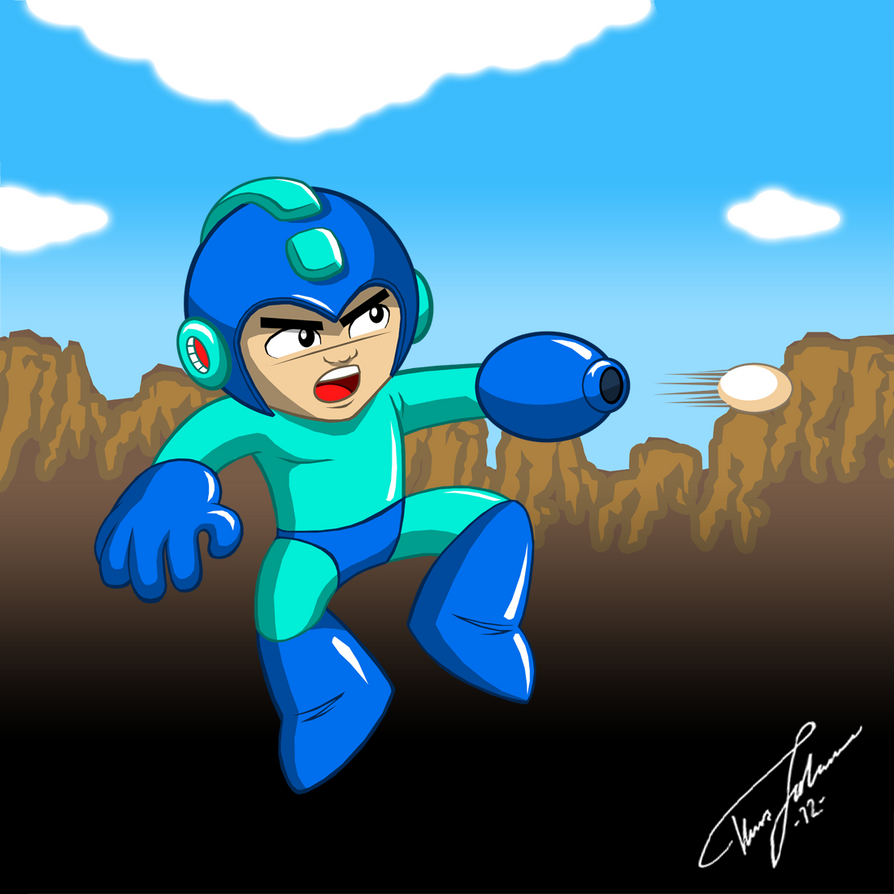
The sprite for Mega Man's eponymous main character, designed by artist Keiji Inafune, is easily one of the most recognizable 8-bit sprites in video game history. In interviews, he has stated that the choice of blue was due to the limited palette of the NES - it had 56 colors, most of which were shades of blue. Wanting to produce a sprite with as much detail as possible, he used two shades of blue for Mega Man's armor and white for the face. The black outline makes Mega Man 'pop' from the rest of the stage.
 |
| Source: www.sprites-inc.co.uk |
But for me, the most important touch is that Mega Man has facial expressions. They weren't unique at the time, even on the NES (Chubby Cherub, released the year before, had even more detailed ones), but their inclusion added an element of characterization that made it much easier to connect with Mega Man and gave the action of the game a more personal, living feel. When you took damage, Mega Man would visibly cry out in pain, and when you jumped he would...

 |
| Source: hyde209 on deviantART |
...shout a fierce battle cry. Yeah, let's go with that.
Effective Backgrounds
Mega Man did not concern itself with realism in its backgrounds and stage design, going for something between Castlevania's detailed, atmospheric quality and the fully abstract graphics of most platformers, giving each stage a concrete 'feel' that was unconstrained by architectural logic. While some games in the series would make a token attempt at 'explaining' stages (Mega Man III, for instance, took place on 'alien planets' where exotic materials were located, while Mega Man VI gave the stages names that vaguely explained their features, though not their layout), most made no effort at all, abandoning realism for artistic effect - a smart decision, in my view, since Mega Man boasts some of the most varied and visually interesting stages of any 8-bit series in history. Once more, clear black outlines made most stages 'pop', and bright, high-contrast primary colors were the norm.
 |
Gravity Man's Stage from Mega Man V.
Note how the enemy strongly contrasts with
both the stage and Mega Man himself. Blue
and orange are natural complements, and the
contrast makes it clear what is foreground
and what is background.
|
 |
Crystal Man's Stage, from the same game.
Again, the enemies, foreground, and
background all contrast strongly, while
the overall mix is quite visually striking.
|

.png)
Both shots are from Charge Man's stage, again from V. Though the actual design
of the stage changes little from the area atop the train to the area inside
the cabins, the changes in color and movement are intense; though not visible
in the second screenshot, the clouds and gray wall are racing past very quickly,
while the cabin in the first merely bumps up and down every few seconds.
This lends a feeling of dynamic progression to the level that it would otherwise lack.
The music rocks, too.
The developers made effective use of color and shape within the limits of the NES's hardware to give each level a unique and dynamic feel. To make another comparison to Castlevania (because I intend to beat the device into the ground), if Castlevania's graphics were a Gothic novel, filled with richness of detail and an atmosphere of hanging dread, then Mega Man's graphics were comic poetry, sparkling with humor and life and the expression of pure emotion. And speaking of emotion...
The Sound of Music
The musical scores assigned to the Mega Man stages were as varied and catchy as the graphics. The composers varied from game to game and were generally credited in the in-game credits with aliases; their names can mostly be found on Wikipedia if one searches by individual game. Regardless of composer, however, every Mega Man game sports a varied and catchy collection of compositions with modern influences ranging from 80's synth-pop to soft rock. Some of these tracks have become independently famous in the gaming world, though none have become as ubiquitous as themes from the Mario or Zelda franchises.
You've heard it, and you love it. This is music to
save the world to.
The Heart of the Matter...
As important as the graphics and sound are in creating Mega Man's unique feel and lasting popularity, the most important element lies in the game's mechanics and design. That contains enough material for another post, however, and so I will leave it for next time.
Thanks for reading,
The Undesigner
No comments:
Post a Comment